Art Technology Group
Tablet Shopping Assistant
Background
Nearly a decade before the iPad was launched, a client approached us with a prototype for a grocery cart mounted device that would function as a shopping list and as channel for instore promotions. As part of a proposal for the complete technical infrastructure I was responsible for creating a few screens to illustrate how our product in conjunction with our interface expertise could compliment and improve the client's prototype. Navigation was "automatic", that is the screens updated item information based on items nearest to you, accurate to within ten feet.
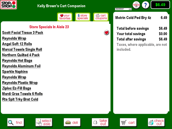
Client Prototype
Problem
The client's original design was very text heavy. It required much more time to read than user would have while moving up and down grocery aisles. Regular HTML text links were used (for a touch screen!). In addition, many real world paradigms were carried over to the interface which really didn't make sense. Who has time to virtually clip coupons, or browse specials (and what's the difference anyway?) while running up and down the asiles?
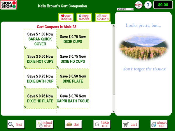
Get out your digital scissors!
Solution
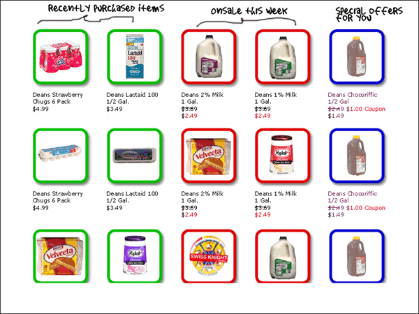
Create an interface that is item-centric rather than function or promotion centric. Make it visual, so user can glance down at it while navigation their grocery cart through the reality of the supermarket. Integrate artificial promotion categories (separated by tabs in the client's sketch) into a flat hierarchy. Keeping the presentation simple, it becomes a tool for shoppers, rather than a vehicle for displaying advertisements. In this item-centric view personalized ads and offers become part of the user's "shopping list", making them seem less "ad-like" and more like something they might choose to buy.
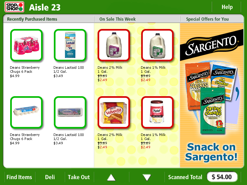
The interface needed to be visual, not textual, and friendly to the finger, not the mouse, for a touch screen. Eliminate the need for tabbing and integrate all items into one view. Show users specials next to their favorites. Let them decide in glance:
The final result was a much more visible, finger friendly, at a glance display:
Back to all projects