eBay
Address Book Redesign
Background
Legacy architecture in capturing user addresses on eBay lead to an extremely frustrating user experience for users when they moved and attempted to update their addresses.
Problem
eBay collects it's first address from the user when they register. The first time they buy an item on eBay a copy of the registration address is used to create the first 'ship to' address. Suppose the user then decides to try to sell on eBay. They must register as a seller and consequently a seller/payment address is created based off the registration address. eBay also imports all the user's addresses from PayPal to use for shipping addresses. Imagine the situation when a user moves. In most cases, they have only entered their address once, at registration. Twice, if you count PayPal. If you search 'Help' or navigate via the site map you will be directed to update your registration address. In surveys, the majority of users looked to update their registration address (and rightfully so) however the registration address does not affect much in terms of day-today transactions. It was not uncommon for users to update their registration address, complete a transaction, only to find out their package had been shipped to an old address. This created a frustrating situation for almost anyone who moved resulting in about 1000 calls to customer service per month.
 There are three places on the page above where you can change your address. Can you find them?
Solution
It was determined rearchitecting the way addresses were stored on eBay would be cost prohibitive so the solve would have to be purely interface driven. At the time there was no one page to see all of your addresses on eBay and changing an address was a different experience depending it's use. Early on I sought to help the team (and myself) understand just how many addresses we collected, where they lived in the interface, and what their function was. I created a model of an address sphere to illustrate how addresses affected each other along with mapping out the flow of how addresses were currently related to each other:
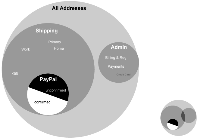
The diagram helped the team understand how our technical concepts for addresses overlapped with the user's understanding of them. I also proposed a few scenarios illustrating how we could simplify the relationship. These quick flows illustrate how deeply nested some of our addresses were, along with our goal state based upon the simplest user experience:
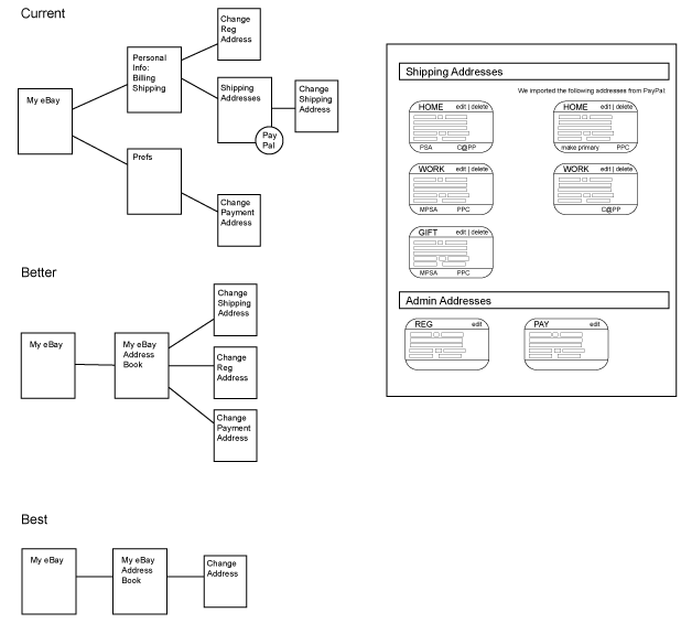
Though it was clear a single address page solution would be the best solve, technical constraints forced the project team to reconsider and a compromise was reached. Once I had an understanding of the scope of the addresses and their relationships I grouped them by use and source in each column. The first column and second column are transactional shipping addresses and the third column represents the administrative addresses collected in one place:
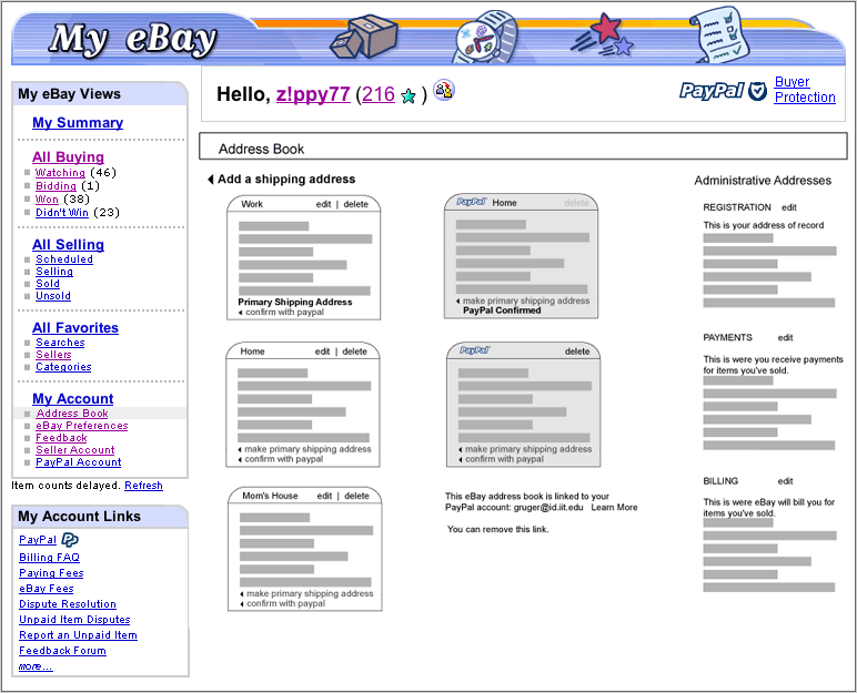
This screen shot represents the design midway though the project based off previous wire frames. The column concept was turned on it's side:
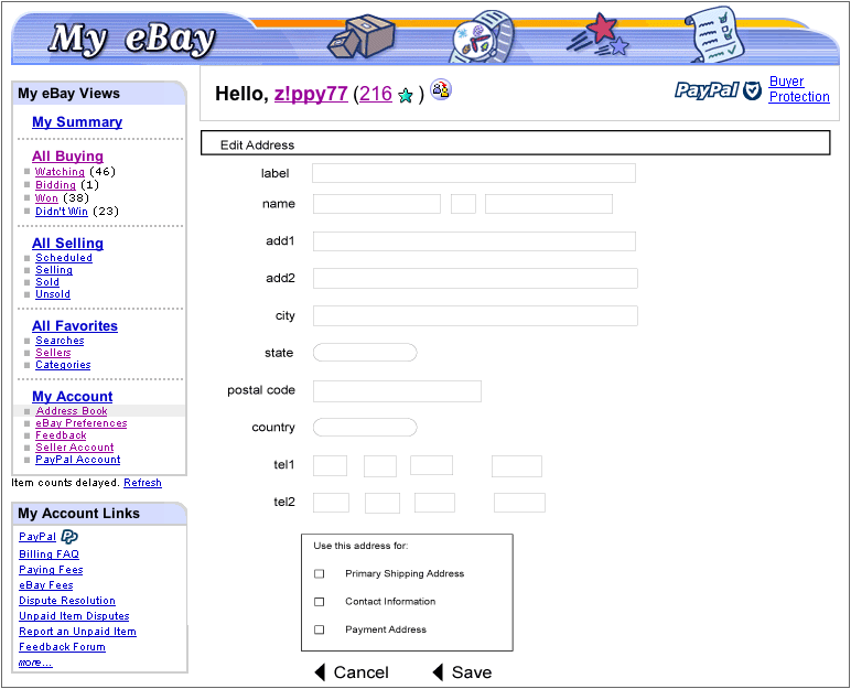
Another key concept to come out of early concepting is one intelligent form to replace the many disparate forms allowing for the updating of multiple addresses with one form:
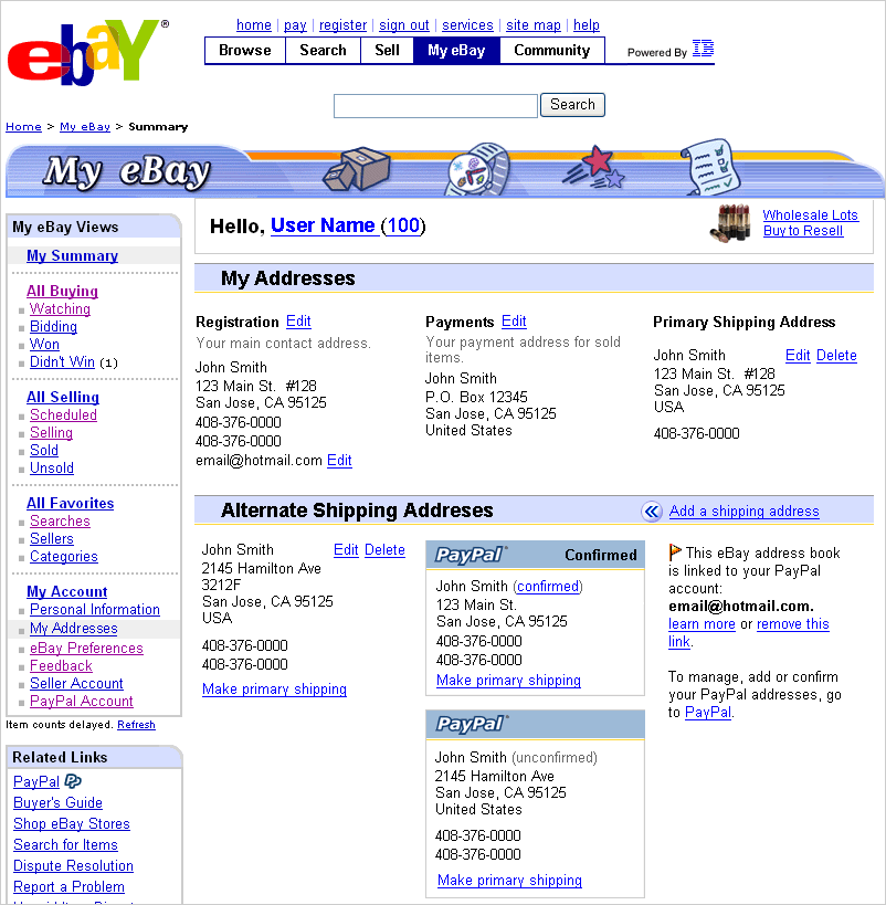
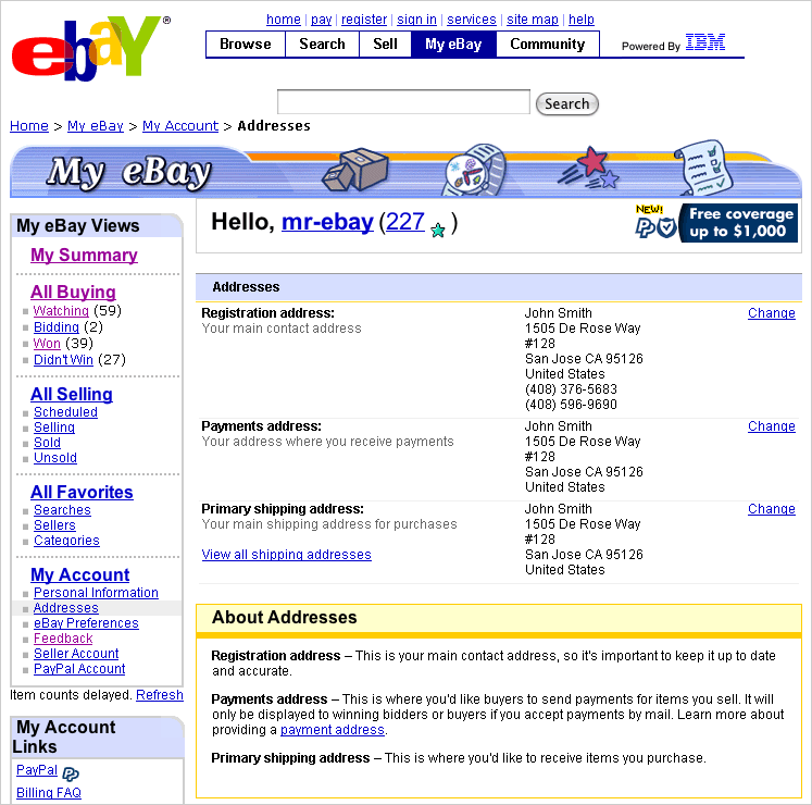
Late in the project, technical constraints would not allow for all shipping addresses to be imported into My eBay. This design does join the three most important addresses to a eBay user on one page, under a dedicated section solving the original business problem of making moving easier for eBay users:
Back to all projects